
Inventory & WMS Operations UI
Warehouse dashboard prototype with AI scoring and reorder intelligence
Overview
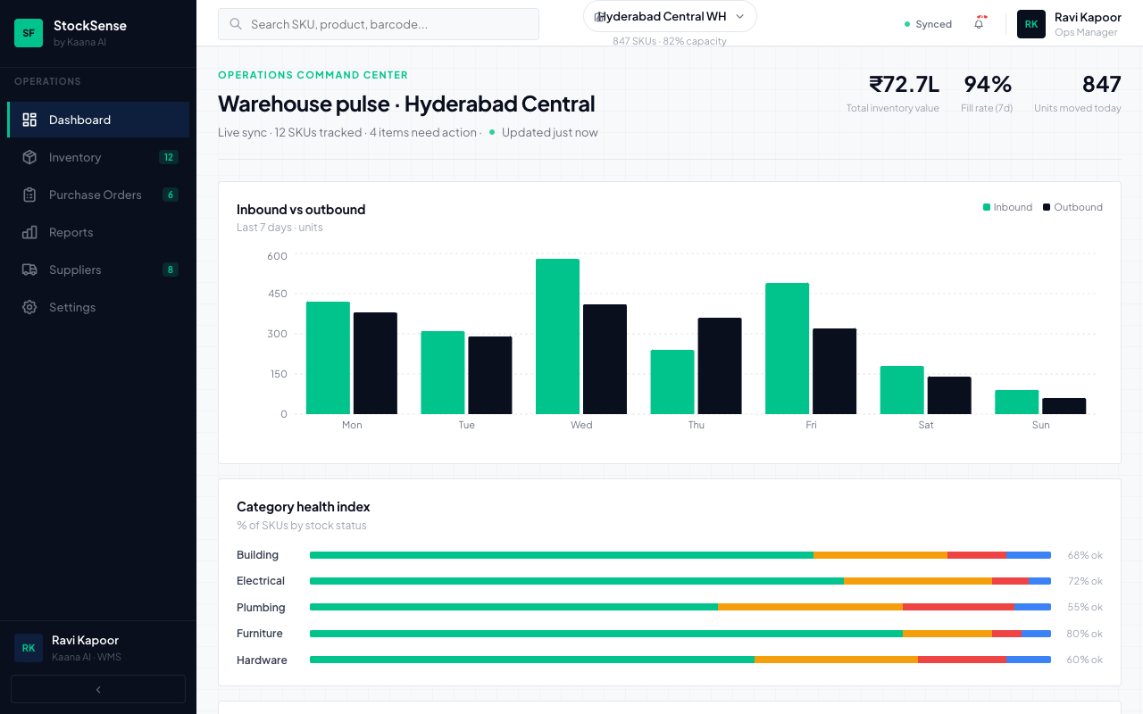
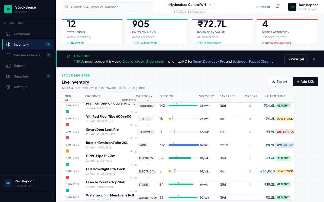
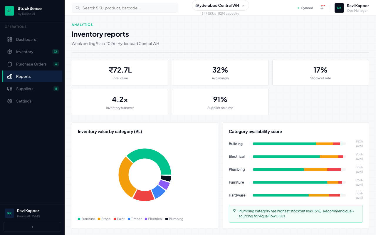
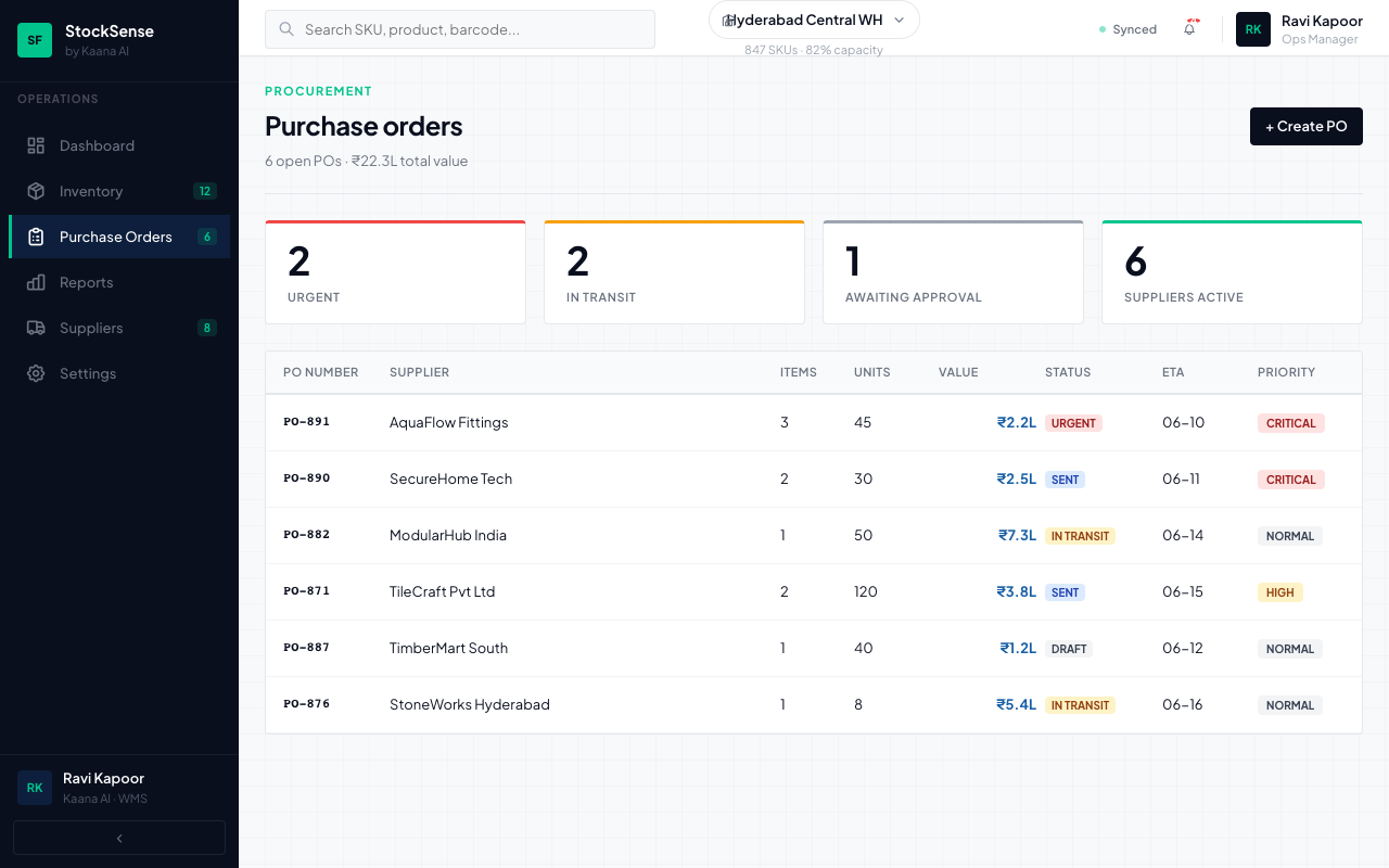
We prototyped a StockFlow inventory/WMS dashboard — dark-sidebar ops aesthetic, inline stock bars, AI reorder scores, and detail panel UX — as a sales demo for warehouse digitization.
Context
Before building a full WMS backend, stakeholders needed a clickable demo showing how inventory ops software should feel — numbers-first, status chips, and AI-assisted reorder hints.
Real-world scenario
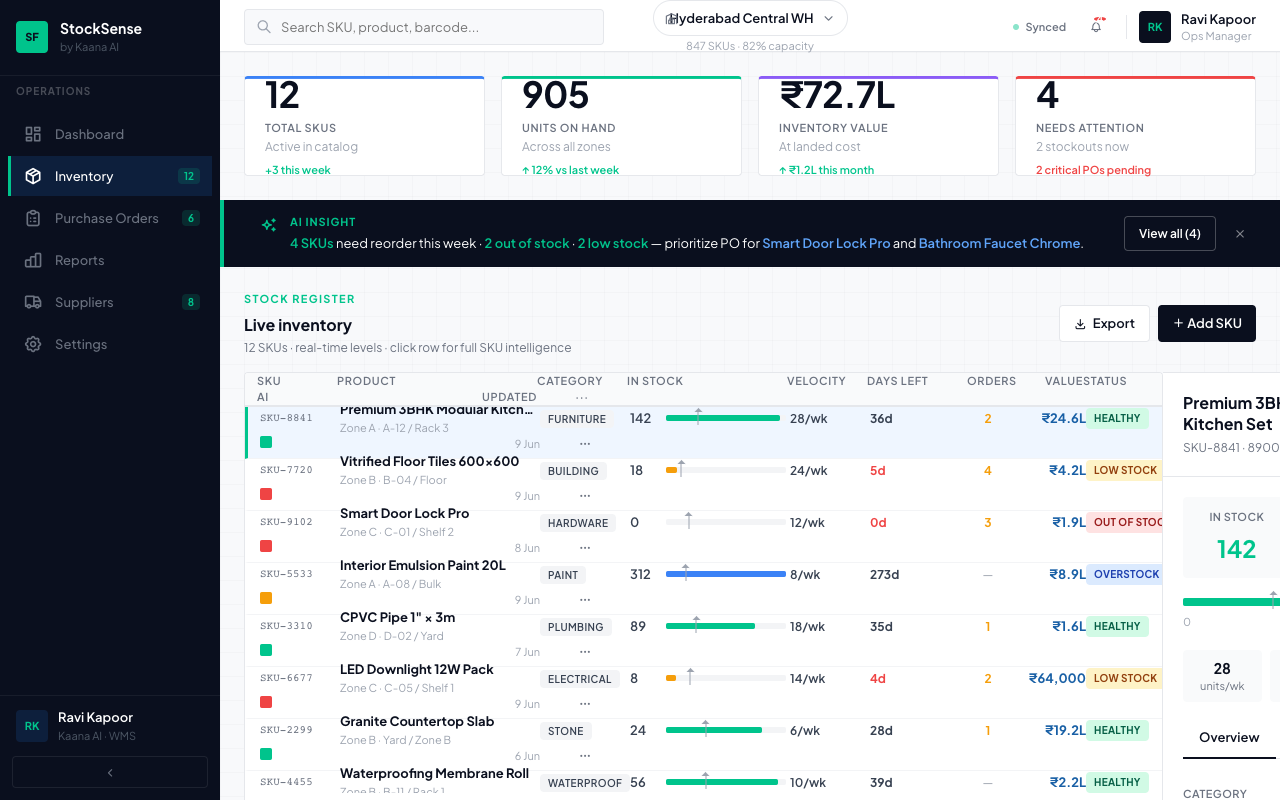
An ops manager scans stock levels, sees AI reorder scores with tooltips, opens a 400px detail panel that pushes the table (no overlay), and dismisses the AI banner after first view.
Constraints
- Frontend-only demo — local state, no API
- Dark navy sidebar + off-white main — distinct from CRM aesthetic
- localStorage for banner dismiss persistence
What we built
- React + Vite SPA with Recharts and local state management
- AI score squares with color-coded tooltips
- Detail panel slide pattern for SKU drill-down
- Paired with kaana_inventory_wms_demo.html static pitch page
Architecture
- Standalone Vite SPA — demo asset for sales conversations, not production deployed
Reliability & security
- Frontend-only prototype — zero backend attack surface for demo purposes
Outcomes
- Stakeholders validate UX before committing to backend build
- Clear visual language for warehouse ops vs CRM ops
Technology stack
Frontend
FAQ
Is this a production WMS?
No. StockFlow is a frontend prototype for sales conversations — local state, no backend API.
What does the AI score indicate?
Demo reorder intelligence scores SKUs by demand, turnover, and lead time to prioritise purchase orders.
Related services
For social · LinkedIn hook
Validate warehouse software UX before you write a single API endpoint.
- → Prototype: inventory/WMS dashboard with AI reorder scoring
- → Purpose: sales demo for warehouse digitization conversations
Want to validate ops software UX before building the backend? We prototype fast.
Discuss a similar project